
 “I need to write our case for support,” said my friend who I ran into at Fundraising Day New York. My immediate suggestion was to identify those words and phrases that would resonate best with his audience. In other words, I wanted to reach through his organization’s social media accounts to find what words and phrases got the largest number of positive reactions (such as “likes” on the organization’s Facebook posts). And so we launched a project, borrowing the web sites of two of our small business friends: Gabriel Colella, a transformational teacher; and Snug Planet, an environmental services company.
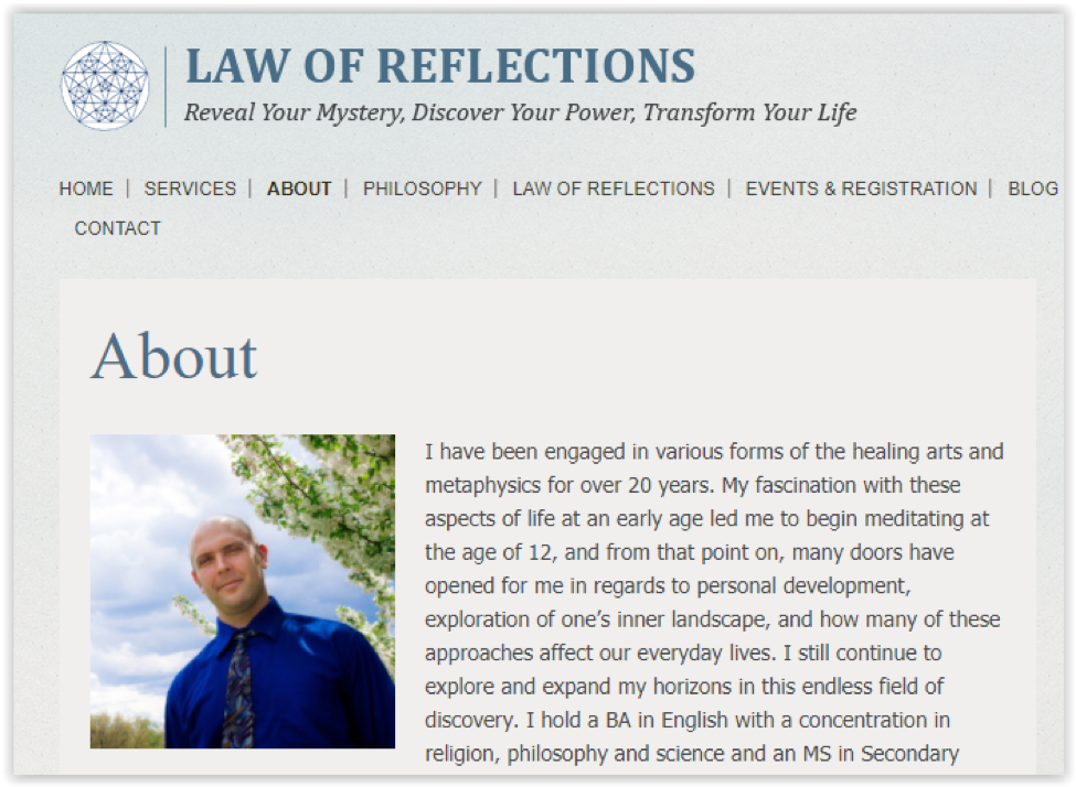 The Law of Reflections website is text heavy, since the topic does not lend itself well to photos of happy customers. We copied down all of the text from the site (with permission), split out the sentences into single words, and built this word cloud to note themes. The larger the word, the more frequently it appears in the website’s text. The different colors are only for ease of viewing the words. 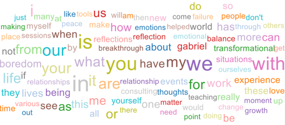 Notice that some pronouns are prominent, with “reflections,” “thoughts,” and “matter” in the second level of frequency. These words make sense on a website designed to differentiate Gabriel’s practice from a larger company or a therapy center – his services are personal and reach beyond ordinary therapy topics. But are website visitors reading the text and thinking, “Hey! That feels like me” or does some other collection of words and phrases connect better to Gabriel’s audience? To discern that, we downloaded the past years’ worth of posts from the Law of Reflections Facebook page and labeled each post with a theme. Here are the ”likes” and “loves” for the top themes (“likes” are purple; “loves” are gold): 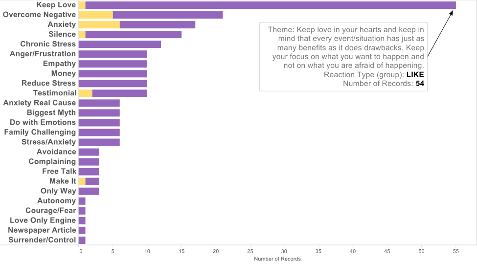 So, we see that Facebook posts with themes around love, stress, and anxiety were “liked” by the Facebook page’s audience. Using this business intelligence, Gabriel will be revamping his web site to include concrete, personal themes. Case Study Two: Business with Products and Services Snug Planet is an environmental services firm focused on improving the efficiency of homes, especially in relation to insulation, heat pumps, and other devices that reduce or eliminate the use of fossil fuels. Services also include energy audits. Here is a snippet from this company’s website: 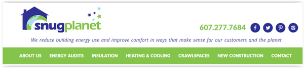 Snug’s website is more complex for your average scraper, offering several sub-pages, photos, and illustrations. Our data acquisition associate, Tricia Tauzin, scraped the site’s text (with permission) for parsing. Here is that resulting word cloud: 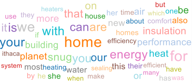 This word cloud makes perfect sense: Efficiency, home, energy, heat, and Ithaca should be prominent themes on the website of a company that endeavors to efficiently save heat and energy in the homes of Ithacans. But what Facebook post themes garnered the most reactions? Here is that table: 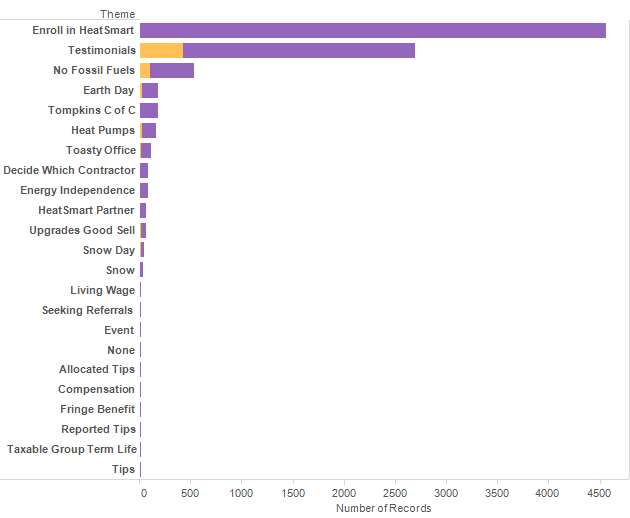 The “Enroll in HeatSmart” post contained a link to sign up to be involved in an initiative that seeks to remove all fossil fuel use in homes in Tompkins County, NY. Imagine having no propane, gas, or oil on your property – that’s the effort. This project overwhelmingly won the “Likes” contest among a year’s worth of Snug Planet Facebook posts. Note that second is the testimonials posts. Indeed, that band of gold tells us that the testimonials garnered more “Loves” than the other posts. Jon and Elizabeth Harrod, owners of Snug Planet, are thinking about concrete information, links, and other tools for website visitors to use to become engaged in the Snug Planet mission. For this company, we also ran a social network test, using the NodeXL product. We found that “Enroll in HeatSmart” also attracted the company’s biggest raving fans, as illustrated below. 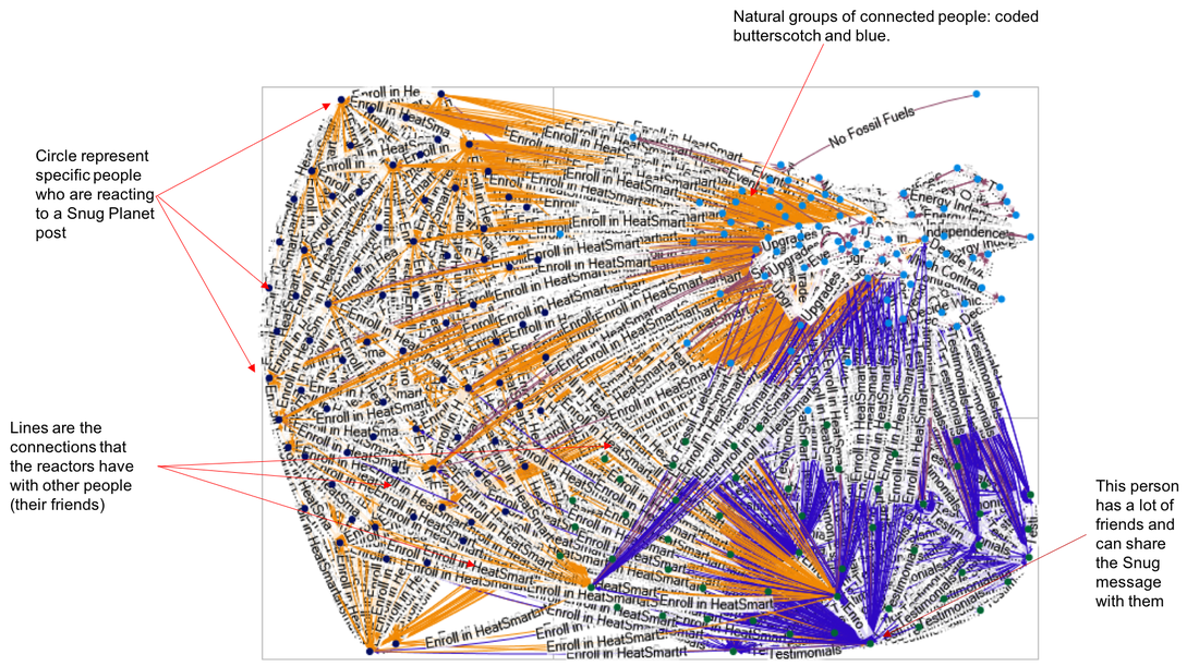 The lines on this network graph show the theme that was shared from person to person. You’ll notice that the “Enroll in HeatSmart” theme takes up most of the graph, especially among the most connected. The different colors represent NodeXL’s clustering of the people mapped here, and you’ll notice that the blue and butterscotch groups both show people with several friends, some of whom have several more friends. The non-colored connections, at the upper righthand side of the graph, represent a variety of other themes, like “Energy Independence” and “No Fossil Fuels.” Remember that “No Fossil Fuels” is one of the main goals of HeatSmart (http://www.solartompkins.org), but giving the reader something to do inspired more engagement than just talking about the concept. We also examined Snug’s biggest fan, and biggest connector. For illustration, we marked his/her connections in red, below: 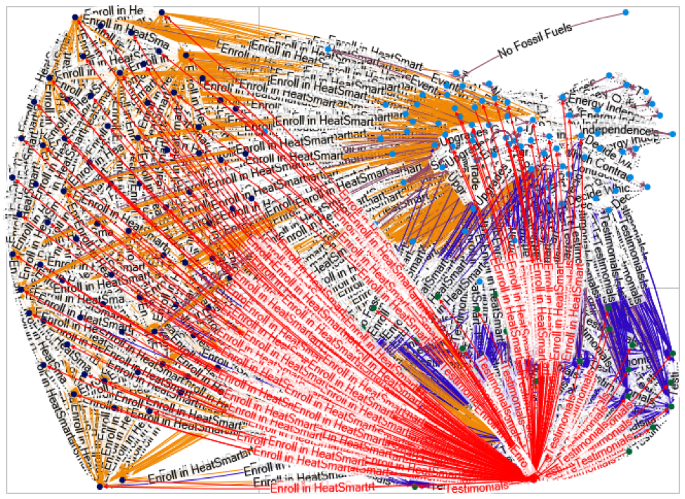 This one person has connections to so many other people that he takes up at least a third of the lines. We shared his Facebook handle with the Snug team, who will follow up.
How to Use These Results We crunched through 3 exercises on two different company sites, bringing back a variety of graphs to look at. But now what? Here are some of the uses of a project like this:
Wrap Up As we walked through these exercises with our kind guinea pigs, I reflected back on the harried expression of my Fundraising Day New York friend mentioned at the beginning. I started to wonder what other sentences can be gleaned from his audience to find the right phrases to connect with them. Does he have emails that his prospects wrote to him? Or any access to survey data? If he does, a project like this would end with a case for support that touches his audience’s heart deeply. Is this something that you and your organization can do? Yes. As a starting exercise, think about just counting the “likes” to all of your organization’s different posts – what wins? If you are getting correspondence from your constituents, what words or 2- or 3-word phrases come up over and over? Give it a try and let me know how it goes. Email me: [email protected] or tweet me: @mpellet771.
0 Comments
Leave a Reply. |
Keep Informed
|

Photos from jeffdjevdet, SMPAGWU