
I have, in earlier years, shown my raw statistical results with my clients, hoping to share the joy of getting a beautiful statistics result. Their reaction was to look up from my PowerPoint and blink at me. My own cardiologist once showed me a series of dots in random spaces across the page, 2 inches deep, scattered all over. He told me that it was clear evidence of how my heart was doing. I looked up at him and blinked. Neither I nor he were getting our point across when we showed those untranslated results.
For example, I added below the output from a linear regression model. It should never be seen by a gift officer or an executive.
For example, I added below the output from a linear regression model. It should never be seen by a gift officer or an executive.
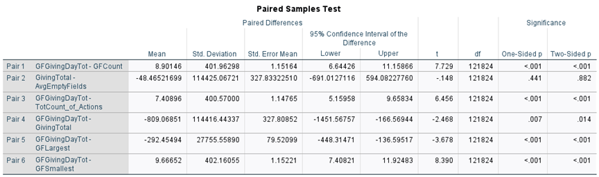
Below this paragraph is an example of what I did share. It illustrates only one of the variables above but makes the point clear and easily understood within seconds.
The client understood right away that emailing, calling, sending newsletters to, visiting, and making other attempts at contact with prospects does work (all counted as “actions”). I made further graphs on the remaining variables that made it into the final model.
Years ago, I heard Alan Schwarz speak on the rates of traumatic encephalopathy among football players at an Apra DMM (now called Data Science Now) conference. He was sharing how traumatic encephalopathy is more prevalent among former football players than from among the general population. He showed us a bubble chart with a huge bubble for the population of the United States, then added to it a very small bubble representing cases of traumatic encephalopathy. His next slide had a large bubble representing the number of football players in the U.S., and then added on a bubble representing cases of the disease. This last bubble was much bigger in proportion to the general population than the one on all cases in the U.S. He showed us in two quick slides how much more prevalent the disease was among football players than among the general population. I was floored. I literally felt like blur got knocked out of my eyes and I suddenly knew how to illustrate my findings.
Here are some other ideas that may help share your findings.
A list of characteristics that don’t go into too much detail, like:
- Solicit event attendees within 30 days of the event or their likelihood to make a gift goes down to 1%
- The ages of our $1 million donors range from 39 to 72, with more than ¾ of them between 46 and 67 years old
- Donors of the top 10% of gifts to your chapter give as low as $1,500.
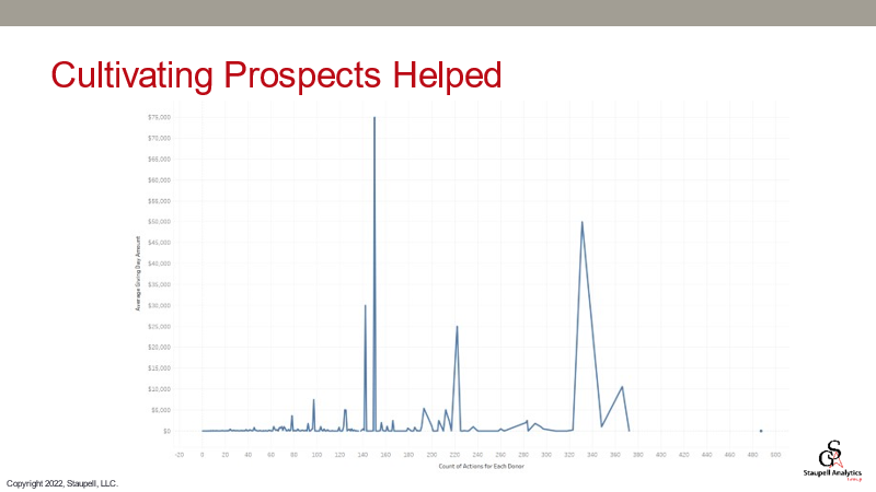
Or just show what they are used to, like this chart below.
Imagine the celebration among your gift officers who have been insisting that it takes 10 years of engagement and cultivation to get the highest gift from a prospect. And if they can’t see that clearly and quickly, take out the record counts at first, and then blend them in to show how many more prospects are in their early stages of engagement.
Edward Tufte repeats in his books that one must remove anything from a chart that doesn’t give clarity. The point of that is to show only the stark reality of the point you’re trying to make. Here is a slide from survey results that commits the sin of using a pie chart, but also shows only the slices of interest.
Edward Tufte repeats in his books that one must remove anything from a chart that doesn’t give clarity. The point of that is to show only the stark reality of the point you’re trying to make. Here is a slide from survey results that commits the sin of using a pie chart, but also shows only the slices of interest.
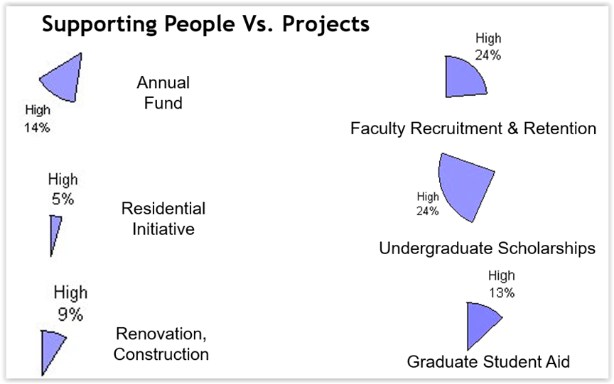
The point of this slide is that initiatives that support people (students, faculty) is of high interest to the survey respondents, where fewer respondents marked building or this random “Annual Fund” thing as a high priority. It was not necessary to show the other slices on medium or low priority.
The next time you try to show results, consider how you would explain it to an uninitiated audience. If that audience sees what you want seen in the first few seconds, then your visualization is a success.
Let us know what illustrations you are stuck on. Maybe we can put our heads together to help you figure it out. Also, see our Water Cooler Chat from 2020 where Ernesto Fernandez of the Harvard Business School discusses clarity in visualization: https://www.staupell.com/video-replays/virtual-water-cooler-chat-visualization